Content

Money Design
Money in The Netherlands
Dutch Coins
Dutch Banknotes
Euro Money
World Wide Money
The Fine Print
This text is one of 65 lectures containing the Proceedings of a congress held in Amsterdam in 1987. Every four year this world-congress is held by three foundations: ICOGRADA (graphical design), ICSID (industrial design) en IFI (interior design).
These Proceedings have never been published and only appeared on a Dutch web-site until approx. October 1997. The text of this one lecture is re-published at this web-site. The official title is unknown.
The images are from the documentary 'Levensloop van een bankbiljet' (Lifecycle of a banknote) made in 1986 for the Dutch National Bank by Jaap Drupsteen, designer of the last series of Dutch banknotes and also visual artist, about the production and usage of banknotes.
"As has already been said I am talking now as a designer. It's a little bit confusing perhaps because there is a chance that I will be coming back here on this stage in another role. I was originally a designer and I am still a designer. I am also part-time director of the Art and Design branch of the PTT. This talk has nothing to do with the PTT. Only to do with my role as a designer for the Bank of the Netherlands. I will only give opinions as a designer and not as someone who commissions work.
 About the distance between the public and a designer. For the Bank of the Netherlands this is no problem, of course. They can say, if you don't like our notes then don't use them. And so there is no problem in fact. But there is of course a problem, at least there was a problem. It was very similar to the situation Mr. de Jong was talking about. In 1964, the bank decided that there had to be new banknotes once every fifteen years or so. Technology becomes more advanced, the technology of forgery becomes more advanced. So, to keep up with the latest technological developments, you have to renew your banknotes.
They decided to ask three designers and artists to make designs and sketches and, at the end of the day, I thought my sketch was the nicest sketch and so I made a 5 guilder note, that was a new value, a new banknote. I have no slides and I don't really mind about that, because I don't like the design and the note is no longer in circulation. I am very glad that I can't show it to you. I can only tell you about it. It was an awful design. Why? Because it was all new to me and I found myself in a strange position with the printing works, not the bank which develops the techniques, but the printing works. It is a private company, the firm Enschede and Sons.
They have a long tradition of doing things in a certain way. The artist comes along, hands over his sketches, his ideas, and then they tell him: 'From this point on, we have to maintain complete secrecy'. So you get back what they have made of your design. Security. Sometimes artists have seen their work back, the banknotes back, and have been unable to recognise the design. 'Yes',they say,'that is for security reasons, the design had to be changed. That's our job. We are responsible for security'. My blood pressure was way up, I must say, when I first started out as a designer in this field working on my first banknote, only one banknote. After two and a half years working on that banknote, I really knew how to design a banknote.
After all those years this first banknote came out and then the bank asked me to make a series, a whole new series. I had reached the point at which I had a better working understanding with the printing works and I asked the bank which had given me the assignment to take this a stage further. I said,'I have to have unrestricted access to every detail, to every technique, to every secret, otherwise I cannot make a good design. I must know what the techniques are, what the real world in which I am working in, producing designs in, looks like. The bank accepted this and put pressure on the printing works. So I was able to make a design that was in my eyes a normal design.
 I am going to show you a lot of slides. It's after all a visual story. I can only say, my main principle was to be clear. Banknotes are very fascinating. They represent a microcosm, a microworld but, on the other hand, they are issued in incredible numbers, you know. Once a design gets accepted for a banknote like a 10 guilder note, then it is printed and reprinted over and over again for twenty years. The number of banknotes issued is enormous. And that means extra problems. The billionth banknote should have exactly the same quality as the first.
I came to know the whole operation when I had open access to the real secrets of the making of banknotes. We worked together in a team made up of people from the laboratory printing works, the bank specialists and forgery specialists. With that whole group working together developments could be made, year by year. It took about ten years for the printing works to really open up, then they decided that it was also profitable for them to have new ideas. In my eyes these ideas were quite normal, not very advanced or anything, but in that world it was all so completely new.
I then realised that the other side to this vast issue of banknotes was that everyone has this thing in their pocket and has to operate with it every day. So, it is just an everyday design product. It is an industrial design in fact. Everybody has to use it. I made it as clear as possible, as individual as possible, so that you could easily see, even as a foreigner, what the currency is that you have in your hand. Is it a five or is it a ten or does it have another value?
I will show you some pictures. I will present the slides at very high speed because I brought with me a considerable number of slides. I could not pick and choose easily, so I just brought them all.
I was a designer in the Sixties, you know, before I started, in about 1964, on this commission. You can see something of my ideas on design at that time. I liked colour. I am a designer who is not afraid of illustration and illustrative elements. I like them. I like typography. I have done that sort of work with a lot of pleasure for different museums, catalogues and books. I like book typography, just the rhythm of lettering and just playing around on pages. I like textures very much and drawing. I draw many diaries, that is the kind of hidden stream in my life. For that reason I have put in some examples of that kind of work. So you can see the elements from which my work is made up, also my illustrative elements and my reactions to the world around me. I am showing these because they are also a part of the design. It is a kind of source, a laboratory for me. I have always liked to work on a small scale. Banknotes and stamps work very well for me.
I was, at that moment in time, making things like this, also technical and pure things. I did a lot of exhibition design. This is an example of three dimensional design I did just after I had started at the PTT. It shows some of the elements you perhaps see back in the design of the banknote. I was able to relate to a lot of techniques through the banknotes.
At the very, very beginning, it was 1967, I started to do some research for the printing works at the university in Eindhoven. It involved looking at what a computer-operated machine could do for banknote and stamp design. At the same time, I also designed a passport, using all kinds of elements. I was already busy designing banknotes myself. So, to conclude, that was the stage I was at and the preferences I had; colour, typography, clearness, bright colour appealed to me and illustrative elements.
What did I do when I first came into contact with the world of banknotes? Well, I tried to get to see all the banknotes of the world. That was easy because the Bank of the Netherlands has in its archives all the banknotes of the world. I came to the conclusion that things like the dollar were not very clear. It is politics. You can of course say, it is important that you see what you have in your hand in order to be able to check whether it has been forged or not. That is a way of justifying the production of notes which all look alike. But I don't think it's nice to the public, you know. I have chosen to adopt another approach, in the belief that what you must make clear is the value of the individual notes.
On the left-hand side you see something of the general impression I got of banknotes. I thought it was necessary to make things more clear, more specific, so that the user would know where to look when he had to look. The Dutch banknotes of that time were not well done. For instance the backs of the 25 guilder note and the front of the 100 guilder were in colour and in use of form very much alike. I also thought that the whole series was made in very muddy colours. I didn't like it but I also felt that it was not very clear. You do see other elements in it. There was already some blue in the 10 guilder note, some brown in the 100 and some red in the 25 but this was not very clear. What I have done is try to give the colour more emphasis without losing the links with the past.
The first time, as I told you, when I made my first banknote, the printers maintained that more colour was an impossibility. They said, 'When you use a green, it must be very dark and blackish green otherwise it's not safe'. After two and a half years, I discovered that this was not true. I just had to keep on asking and asking and finally they said, 'Well, we put black in it because it is easier to check. Besides, it has been printed in that colour for four hundred years. So that is the most safe colour'. These were not very satisfactory arguments so I tried to push things a bit further. After all, nowadays, they know that these very brilliant colours are much more difficult to forge than the blackish colours.
 I decided to adopt another approach.
I decided to be as flexible as possible. The only money I had seen which was as clear as I wanted money to be was Monopoly money, the pretend money. That was nice money in my eyes, so I hope that my own work looks a little bit like that because it was for me the only real example of clear money. Clear for children, clear for grown-ups. More adults than children play Monopoly, I think.
You can see the differences between the things I had to make in the first series. I had got a commission for five banknotes; 5 guilders, 10 guilders, 25 guilders, 100 guilders and 1000 guilders. The Bank of the Netherlands made it very clear to me what they wanted.
The bank, by the way is not the government, it's an autonomous Dutch bank. It is also of course not private but it makes its own decisions. They specified that the notes had to have portraits on them of famous historical figures which would not create any political problems. And I accepted that but at the same time made the suggestion that it was not necessary to be so careful. I didn't believe that anybody knew who the people were who were represented on the banknotes.
That turned out to be true. After we conducted some polls, it was clear that nobody knew who these people were.
So gradually I got to make more banknotes. They asked me, they said, 'You know so well what's good and bad. Think something out for us'.
What I am trying to say here is very simple. I chose very elementary colours because it was a small series of only five values. So I went for the easy options, in fact. What I tried was to be as white as possible in the background and by contrast as clear and brilliant of colour as was technically possible. The objective was to use very clear typography, so that when you folded up the note you could see what the value of the banknote was at least four times.
I also did things for the blind. I was really amazed that this sort of thing was being done for the first time in the world. I didn't realize that at the time. We did a lot of research into what it was possible to do for blind and near-sighted people and we hit upon these small things on the left-hand side, little balls that you can feel.
 Well those were all the basic elements. You can see for yourself. I tried to combine old skills, old crafts. Because there were really very good craftsmen, the engravers. Jan de Jong has already said this. It was very difficult for me to let an engraver be an engraver and not an artist. And so I included one part in the process, that you see here, that involves hand engraving and I combined this with computer-made very fine mechanical structures. All this was done in a very sophisticated way so that you couldn't separate these things. In photographs of the thick parts, you lost the thin parts and the other way around.
Well here you see the things for the blind which were also, as it happened, easily compatible with the techniques.
I am now very proud of the fact that what I thought out was, in fact, very advanced. I didn't know at that time but they can still work with these ideas and easily scan the notes with electronic eyes.
You can see a whole technical panel on the left-hand side here and there are all kinds of control things. Previously these were always hidden but I thought it nonsense to hide the technical things. Make them as clear as possible so that the production can use them easily. Not only that, the checks afterwards at the Bank of the Netherlands could be mechanized and make use of electronic eyes.
Here you see details made by the computer. You see the front, the back, the problems involved. You know you had to cut out these things precisely. There is no waste, everything had to be exactly in place. You see all these small blocks which are there to make sure that cutting is precise. This process can also be controlled by electronic eye to avoid the line which, as all designers know, you get if you allow pile up. We put two colours in that small block. The knife cuts through so that if on one side you get a little bit too much colour, then the electronic eye moves to the other side et cetera. It is quite simple, but it was new to have it all very worked out in the design.
I used all the technical know-how to make a design. And, well, there are a lot of drawings and things of course. I will go through it very briefly just so that you can have an idea of how much fun it is. A funny world. It is really nice to do. We have to make these for every millimetre. I mentioned the two elements, one of which was the hand-made element, the hand-engraved drawing. This is not the final drawing but this is one of the drawings I made and then I talked it over with the engraver and it was very,very carefully engraved.
I put something personal into this, my fingerprint in the hair of one of the world's most important philosophers, Spinoza. Very unholy of me, not very nice. You see there is my hand, my fingerprint to the left and the result of the combination of this hand-engraved part and the rest that was done by computer, an experimental computer. In the late Sixties I started to make all kinds of structures very well equipped for making banknotes.
The funny thing is that this very old fashioned firm of Enschede was the first in the world to use computer-aided machines for its banknotes in this way. You all know these systems now, it's nothing very new nowadays, it's very useful. Making structures that you cannot make so easily by hand.
So fine that even in this enlargement you don't see all the lines. They are specially made as a kind of trick for raster forgery, raster copy.
Well all kinds of proof prints of course, a lot of them, very funny everywhere people with guns. It's loaded, a printing works! There is a moment....... so much money makes it a very special atmosphere to work in. Well the results as they were for a 1000 guilders, this is still the old series.
 In the meantime I was always drawing and generally fussing around and having all kinds of beautiful traumas, different kinds of frustrations. Just a normal designer, I think. And I had nice sexual experiences as you can see. You know it all works together. You must have pleasure in your work as every designer knows. Design is fun after all.
And so, many of the elements I tried to use in this world were elements I liked or thought were profitable. I think it is necessary that a good design is good to use every day but on the other hand I think it is very valuable if there is something personal in it. That you can see it is made by an individual. I liked it so I tried to have something of myself in it.
This is a new serie. By the time I had finished the whole series, new developments had come about and they asked me to make more notes and even a second 100 guilders, in order to adapt things to the new developments but it had .. well it was very difficult, the time is too short to talk about that. I had to make a complete whole of the series but all the banknotes you see now are of a different kind. However, as a whole it is still a kind of series. But in it are all the developments of all these years. As you see I have been working on this for more than twenty years.
So these are new developments, photography, colour photography elements are new. These elements you see here, involve different colours in one issue, all kinds of experiments. I could talk for hours about that, really interesting new developments in printing and also the printing works got fascinated by their own developments. That was really nice. After all these years, they trusted me more or less and they got a lot of pleasure out of seeing new things, new developments, et cetera. It took really more than ten years but after all it worked. So a new banknote came into circulation and after that a new 50 guilder note. You can see new elements coming in here.
I had to change the typography, for instance. That was also for technical reasons. You will see that on the later things. But also in the new developments still the skill of hand engraving is very important and there is still the combination with hand engraving.
So I made these drawings and had them hand engraved by a very experienced engraver. The combination involved mechanical work and the computer and machine drawing.
In the meantime there were pure scientific, pure research developments. Just to test everything possible. The printing works has to operate at the highest level. They have to do the utmost that a printing works can do, and at the same time be highly specialized. The horrible thing is that a forger only has to make a few copies so he doesn't have all this trouble. A difficult fight. You see the results in the new 50 guilder banknotes from a few years back. Details in which you see all the elements I talked about are there, also the deep printing.
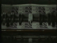
The banknotes are made using three printing methods. Most of it as you see on the left-hand side is offset. On the right-hand side, on another machine which is always causing problems, there is deep printing and also book printing.
I carried on and on, I couldn't help myself. I went to America and Spain and I didn't like it there. These are just reactions in between, related to the banknotes. Some of my frustrations. I made stamps in the meantime amongst other things. As a designer, I developed too. It is not easy to make something, to work on a design and know that in fifteen years you will still be working on that series.
You will see that design developments are contained in the design of the banknote. Well this is the latest one. A book cover I made. It came out a year ago. All the developments of all these years are in it. In all honesty I can now tell you that it is the most advanced banknote in the world. At least technicians say that to me. I can repeat that here with some pride.
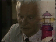
Well all the elements are in there, all the different layers, I tried to be as clear as possible, to have easy themes. A lighthouse is not only a phallus but also has something of strength in another way. We all live below the dikes so we like something which is watching, a symbol of safeness in a way. We all live along the coast as you can see. I used to use a map of Holland, because that is something that everybody in Holland knows. And you see very small lettering. All the lighthouses of Holland are on it.
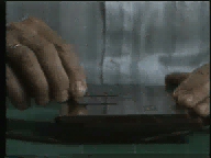
There are all kinds of elements in the banknotes to make it easy for the public to make checks. There are four checks possible. Number one is that even when you feel with your thumb over that rhythm of the lines, it's specially made for that, then you have to feel something. It's not easy to get these thick lines on a copying machine for instance. So that is the first check, can you feel the ink? OK.
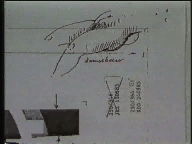
Then you can look through the note and you see a watermark that is a rabbit. It was a rabbit belonging to my girlfriend and this is a small monument. That is the nice part of making banknotes. You can make monuments by the millions. Everybody has to walk around with my rabbit in their pocket. I like that. You can see the microworld. It is nice to enlarge banknotes, you can see there is a lot going on in them.
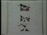
There is a third check, an easy check for the public. Look on the front, and then look on the back. There are two parts, two elements but when you look at the light, these elements have to fit exactly. The front you see on the left-hand side. Printing on the front and back has to be exact to within one hundredth of a millimetre, exactly typed together. You can easily check that, you see that together they form a well-known Dutch bird.
And there is a fourth check. The smallest lettering that you see in that white square, well this is meant so that when you are sitting somewhere, in a private place like the toilet or somewhere like that, you have something to read. You can read all this lettering and you see all the signs. And when you can really read the smallest lettering, that also is a good check that the banknote is all right.
There are of course also checks built in for people at the bank, people behind the counter. Then you need some instruments like the red filter on the left which make it possible to see a white rabbit against a dark background. And here on the right-hand side you see very small lettering which you can only see with a very strong magnifying glass. It is perfectly printed, it is specially designed lettering for small lettering of this type. There is a famous Dutch poem printed on it. If you have a lamp like this, an ultra-violet light, you can see these various elements in the banknote. They have them in large shops and banks.
That's the story of Dutch design on banknotes. You can see more at the exhibition here. What I can say to conclude is that the reason why I could design, be a real designer in my eyes, is because the Bank of the Netherlands was very clear in the way it handled the commission. They were very clear in making a nice division between my role and their role. They said, regarding a lot of things: that is your business, you know. Even the first president I talked to said, 'It's awful what you make but your arguments are sound. It's your profession and my things are in it and if it is safe, OK. Your arguments are very intelligent and very reasonable so I accept them.' I have always appreciated that very much. The other presidents with whom I have had to work used that same approach and the most recent president gets a lot of pleasure out of what we do. So now it all runs quite smoothly. That is my side of the story of Dutch banknotes."
Money Design
Money in The Netherlands
Dutch Coins
Dutch Banknotes
Euro Money
World Wide Money
The Fine Print
René G.A. Ros
(Private email only! Business and hobby email via the concerned website only please.)
Please do not contact the author about collecting or trading coins or notes.
4/7/1997, rev. 01/28/2013
© 1997 -
2026, René G.A. Ros